Thursday 28 August 2014

Cat-Tails in the Swamp

(Really couldn't live with a title like Swamp Thingy.) As my intention is to feature Cat-tails I've renamed this piece. A week later I'm ready to continue.

One of the reasons I've waited before going ahead with this piece is I needed to have a closer look at the features of boreal swamps in Ontario. I was in the Burks Falls area and you don't have to look far to find beaver activity and flooded meadows. I took some good pictures to help me.


( If you want to know what's in the background, it's  a piece of crazy: google Screaming Heads, Burks Falls.)

Colour and vegetation transitions were my interest. Dead trees abound but wetland vegetation is lush.

So let's recap where we left off. A line of trees was stitched at the horizon line. At least three colours in greens.
I started today, by finishing the sky. I don't usually do that this early but if was becoming a nuisance, unbound. Simple meanders to imply cloud.

Then I stitched some understory vegetation on netting to apply at the base of the trees.

 
It becomes important to establish how large your features at the front are going to be so the vegetation can be enlarged progressively as you move forward.


Another island of shrubs and dead trees. These stumps rise above the trees at the rear.


The little salt flecks of near white became the locations of clumps of scattered Cat-tail.
So after four solid hours, that's where we are.

These bands of yellow demand a different treatment.

 
The colour yellow begins to dominate the vegetation, the thicker the grasses become.


Tuesday 26 August 2014

Four Inuksuk - Final

Well while I was away, I did accomplish SOME things but not as much as I had expected. I guess I had TOO relaxing a time. LOL

My four Inuksuk are finished. I added a little paint post sewing, some shadow on the ground and a few highlights in the lighter parts of the sky. In all I'm very pleased with the drama of my sky.


There is lots of variation in the ground, the sky and the rock formations, so they certainly don't look alike, at all. When I quilted the sky, I decided the best approach was to pick out the "cloud formations". The ground was lightly stitched to add texture, and the Inuksuk, themselves had colour picked out and emphasised.


Thursday 21 August 2014

Swampy Thingy ( For Want of a Better Title)

This switching between painting fabric and sewing is beginning to take its toll. I'm restless and don't sleep well and monkey mind all night. Planning on going away hasn't helped because I've just been putting off doing something, Anything. So I just dove in today.

First order of business was getting my little Inuksuk ready to travel. I tweaked them a bit with some ink and paint and anchored them with their batting. The primary job left with them is the sky. That's just freemotion work. With these small pieces I don't mind interruptions. (You know, things like Food and Drink and evening sunsets.)


I also spent about an hour painting the background for the wetlands and cat tails. I wanted water. I knew if I used the transparent paint it would simple combine with the other colours, so I went to my Derwit ink sticks again. The clean colours sits on top of the base. That combined with a little pearl paint which is also opaque gave me what I wanted. Both are permanent with heat setting.


And then I just dove in to work this piece. I can see the islands or firmer ground with its brush and growth. Now I need to bring it out of the material. I started with the far horizon.


 The slight bleeding of the green into the sky was the perfect jump off for trees. Three colours later...


This piece is slow and careful work. I'll try to remember to take lots of pictures while I'm away.

Wednesday 20 August 2014

Portable Art- Four Inuksuk

As I'm going north for a long weekend, I need to take some work with me (so I don't go crazy with the peace and quiet?) I'm in the process of assembling some small works that I can free motion. I don't want to be hauling materials that I might have to cut. They just take up too much space.

These four pieces are going to be a set of Inuksuk destined for the gallery in Golden. Raw edge applique and probably some of my NEW pearlized paint to give them a little sparkle in the dull Arctic situ.
Recognize the sky? I chopped my fat quarter piece of gray into four equal sized pieces. I think it works very well here.


 To simplify things I used the same ground materials in different amounts in each of the four. They are unified by that but contain different Inuksuk.


Tweeking the Colour

This piece was not the right colour. It was too green. Last night I added browns and orange in stages.

 
I started with a very pale wash off grey. Muddy water, no more. This was let dry and ironed.
I mixed some brown and with a very fine brush applied it selectively, dried it and ironed.
Still wasn't happy so this morning I mixed some olive green by combining the brown wash and some remaining green wash and got the colour I wanted. This too was applied with a fine brush. And as a last act of bravado I splashed fine drops of the olive over more of the surface by striking the brush above the cloth.

 
Now I have something closer to what I envision. Swamp or Wetlands.

Tuesday 19 August 2014

Sunshine = Fabric Painting

Today got HOT quickly and unexpectantly. We were out shopping and I made hubby turn around and take me home.

(It's all his fault anyway. He encourages me...........and we'd hit the limit at Costco.......... Evil Store).

Last evening I was sitting in the garden noting how the understory branches of my elm tree were turning mottled shades of yellow and green. I thought the next chance I get I would make material suitable for leaves. And I did. These are both fat quarters. (Have to ration my materials.)


This may seem a little intense in colour but when only pieces are used, there will be some nice blends. A keeper.

The second piece I had a specific locale in mind, marshland or wetland. I deepened the green toward a muddy shade but didn't quite get there. An over wash of sienna or orange should do the trick. I don't need the sun for that. Sky is a little pale but grey. This one's a keeper too.


I'm learning how to get a hard line as I go. An application of a thin line of concentrated paint is laid down and then not brushed out. The subsequent application of wetter paint around it draws out the paint but generally leave a thin line. There is one at the top that looks like horizon with trees in the distance and a couple in the body separating the orange/gold.
To get a distinct grey sky I let the green dry and then starting at the top I gradually added a grey wash to within an inch of the green edge.

Sunday 17 August 2014

Red Fox - Final

When I look at this guy I feel I should give it a title reminiscent of Aesop!

       " The Fox and the Cardinal"

It took me a couple of false starts to quilt this piece. I love this material as it has so much potential, even though it seems rather dull and drab at first glance.The diagonal is not even and starts and ends to often. So I went with horizontal, up to where I wanted to imply foliage. I change the spacing and created small squares.

I added 6 leaves from the same background material and over painted them for a little punch. This was much more in keeping with the subtle feeling I wanted. If I had used a different colour I thought it would detract from the characters.

I auditioned the simple teardrop Cardinal in the same colour as the fox but went instead with a bright orange red. It is so small that it doesn't weigh the piece down, the Fox still commands centre place. Finished with a simple narrow binding in the background colour.


Perhaps this scene is not feasible in the real world but............what fun is that!

Saturday 16 August 2014

Back to Work

Yesterday, I wasn't in the zone. Today I am. Yea!

Again an image had been percolating at the back of my brain for months. I was trying to find the proper way to express it. I suppose there is no proper way, but it has to appeal to me first.

I came across a lovely little water colour of a fox that I reduced to this. 3 colours.

 
I wasn't in the mood to do my usual fusible web applique so I tried another method. A friend had just finished using this different method to do a very attractive cut away applique.
After drawing out a template I layered all the materials that I was going to use, this time simple quilting cottons.

 
A full size cartoon went on the backside and I stitched all the lines in the picture.

 
Then I spent a very peaceful couple of hours listening to some Loreena McKenna and snipping out the excess fabric. Then another 3 hours satin stitching all the edges.


Who is this dear Reynard looking at? That's for tomorrow.


Friday 15 August 2014

When Does A Sow's Ear STOP Being A Sow's Ear

Lord I HATE when I'm between projects. And it shows. I've been cleaning up and came across an unfinished piece from last Fall. There was a reason I abandoned it.
I'm sure there is an equivalent in all languages but my title refers to a saying "You can't make a silk purse out  of a sow's (pig) ear."

But another view is sometimes, SOMETIMES you simply have to finish something for its value or beauty to show.

The reason I had so much difficulty with this dragonfly was I wanted to feature the fabric. Sort of back assward.
After you spend a lot of time fiddling with a piece and it still doesn't please you, you're in a hard place.
So I finished it.


Even looking at it on the screen I'm not proud of it. I LOVE the background fabric but..........
Some one may love it..... but it isn't me this time.
They just can't all be great.

Tuesday 12 August 2014

Totally , TOTALLY 180 degrees Crafty stuff!

Well I succumb to the sewing urge...........and made trinkets. Yes Trinkets. Crafts!

I'm meeting 2 dear old friends in TO tomorrow for lunch. We used to work together. We watched each others' children grow, and now its a weddings and funerals relationship except for the occasional GIRL'S LUNCHEON. ( YES )

Should be great fun. AND I decided to do the hostess gift thingy. These little change purses were posted on another forum last week and I though I'd make a few. One of my friends has a GD as well as a DD so I had to make four.

The first one took about an hour...........the last one 15 minutes.
Looking forward to tomorrow.

 LOL

PS: 8/14  5pm -Two hours on the road into TO and 2 hours on the road back out......but we had a wonderful time.  ( I'm the "baby" of the group, on the left.)

Monday 11 August 2014

Painted cloth -Time to Take Stock

The weather is changing today so this will be the last of my painting for a bit. Apparently I've been a BEAR ( according to DH ) and I'll attribute that to my not sewing/working on anything at ALL. (I did have a DJ package and it's disappeared $$%#$#^) It will turn up but It has contributed to my grumpy mood.

I decided it was time to get smart about this painting stuff. I've almost used up $60 worth of paint PLAYING. I really didn't know what I was aiming for. I'm sure that contributed to my mood too. So I decided today for the last of a bit, I would give my painting a focus.

I took a few minutes to mix of a small amount of the secondary colours. While they aren't often featured in my work ( Except green) they are very necessary to put minute shifts in the colours.

Talking with DH, ( who is a brilliant photographer) I was bemoaning I had used almost all 250 ml of yellow.
I had discovered, when you make green you add the blue to the yellow, and when you make orange, you add the red to the yellow. They demand a far more skewed ratio than half and half. Apparently that explained to him the order YMCK, the colours in Printing and silk screening: yellow, magenta, cyan and black.

 
So here are my base colours. These are mixed a little over half and half with water. This stuff comes like sour cream.
 
I've gone thru almost 8 1/2 yards of white cotton @ $5/yd. That translates into about $2:50 a Fat Quarter. That's usually the limit I will pay in stores unless its REALLY cool. So I guess this is still in line. ( I just bought a whole bolt of 40 inch white..20 yards....BUT...)
 
Today I decided I wanted a piece of night...or dark... whatever. Transferable to sky, or water, or stone.
 

This is very dilute black, with a touch of blue and green. Its dried quickly in the sun. It IS ironed flat.
The lighter areas are from the way the paint moved. I rumbled it wet on the grass. Could be a very interesting background. But I will probably over paint it.


This piece has me gnashing my teeth. I was aiming for sky at sunset etc and while my back was turned the wind blew it into a heap and the black dried unevenly.
SIGH! Not a complete waste but........

On to the mop up. That wishy washy blue took up the black.

 
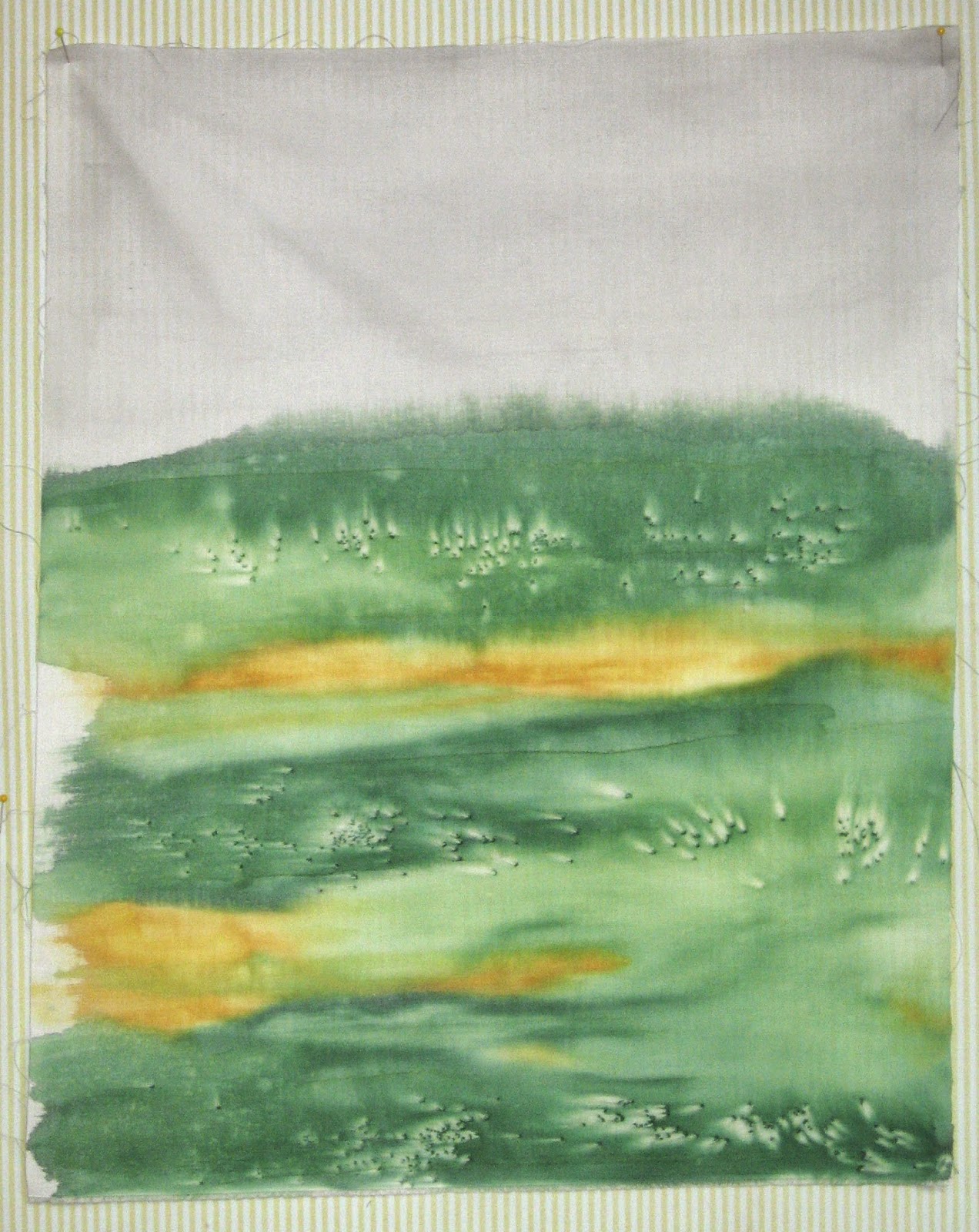
And my "I think this one is almost done".......is done.

 
I had excess red so I blended the yellow orange and red and "painted " it onto the water proof sheet and lay the piece on it. Definitely a field of flowers now.

So that all for a bit. This process generates so much clutter that needs to be controlled and organized, so its not like army manoeuvers every time I want to paint.

I still have lots of good weather ahead.


Sunday 10 August 2014

PERFECT Paint day

Good thing I don't have any burning desire to sew right now. Decided today to concentrate on analogous colours of Blues, Greens and red. I stretched the green a bit into a lot of lime but its still good. And because the sun was brilliant today, the salt and the sun prints worked very well.

So here are the four in situ, on the grass.


 The blue was salted


Mop for blues and red

Sun printing using grass and clover and a few mum leaves


Tiny stars from the dollar store


After clearing away the salt and ironing, this proved to be a fine example. There were 3 shades of blue used here, leaning to turquoise.


Using graduated shades of green with increasing yellow, again 3, nice clear sun prints.


This one worked better than expected. These Stars were less than .5 cm in size. Nice clean edges.

 
And another rather ethereal mop cloth. The creases are actually channels of migrated paint. When the first colour blue was set to dry, I rumpled the cloth so it would migrate.

Saturday 9 August 2014

More Paint Play

I have a few days coming up with some heat possibilities, so GOTTA PAINT.

I spent some boring time over the past few days trying to organize all the stuff that you start to collect with this activity. The paints themselves, containers to dilute the colours in, containers to mix the secondary colours and containers to make blends in. And As I'm doing all this I'm cognisant of the cost if I make MUD.

Consequently I'm mixing very small amounts and diluting them, perhaps too much.

The setting up time and cleaning up time is a nuisance but I am being over cautious and therefore really slow. I've not yet really proved to myself that this will wash out of my clothing etc. I've even taken to wearing my old chemistry lab coat or my big chef's apron. And on a hot day, they are hot. Doh!

So I thought I'd try some yellow today. I mixed a very small amount of gold/orange. Poured it over a wash of the primary.

 
This has some interesting movement for an art piece, and this is where I have to remind myself I'm not tiring to create an art piece.
 
 
Tried more salt and it worked minimally but I also (cause I can't leave well enough alone) added a bit of yellow Rit and Red Rit. There seemed to be more movement from the dyes than the paint today.


This one turned out very interesting. Only the primary blue and red but very diluted in some areas and more Rit powder. The blues and reds seem more responsive to the salt or the colours were more intense. So many factors. And the sun was definitely HOT now.
 
I did over paint some of the previous pieces as well but I was feeling a bit confused as to what I was really trying to accomplish so I stopped there and MOPPED up. I think I'm getting pretty close to the colour tipping point here.
 
 
Enough today.